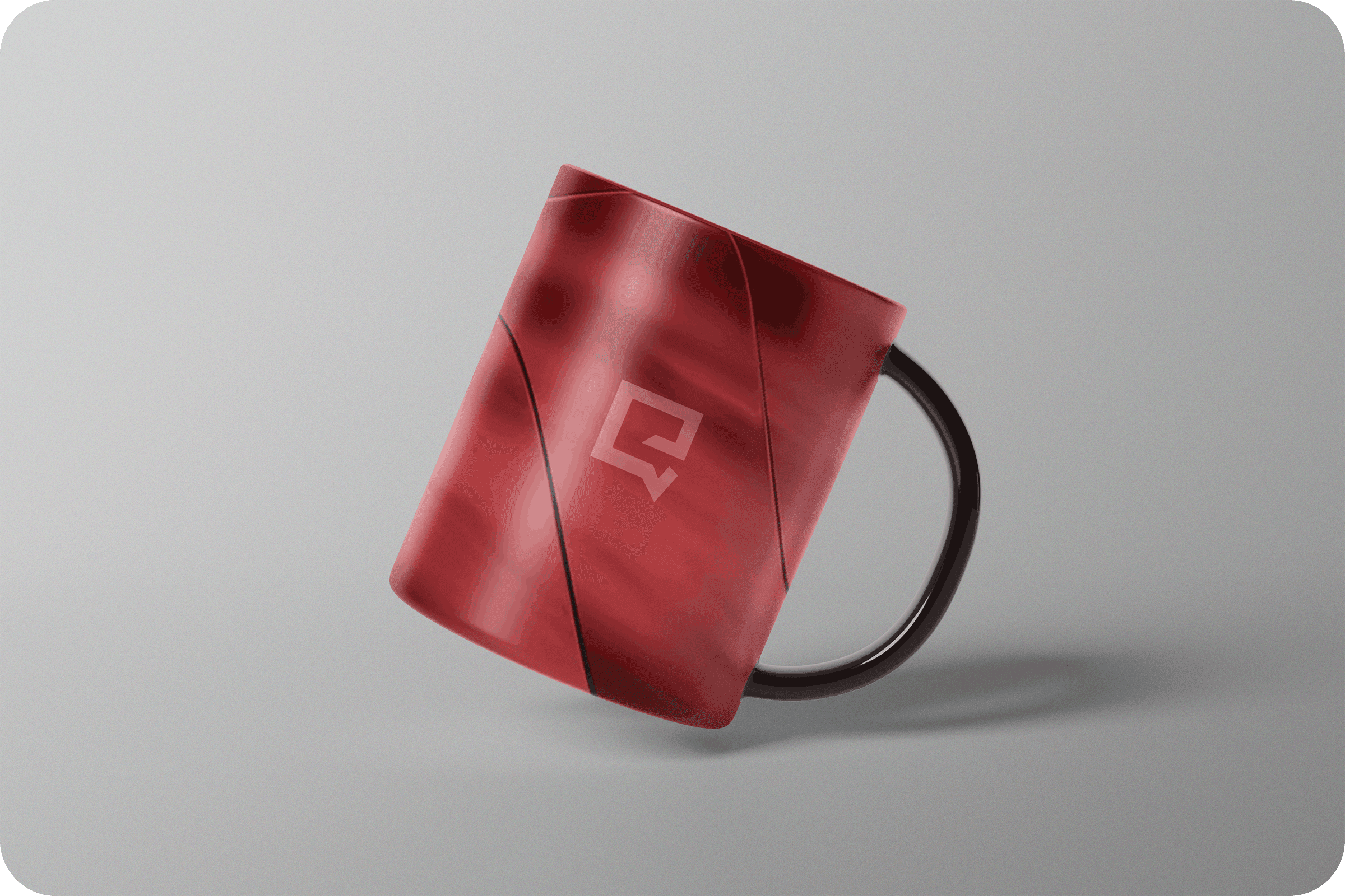
EVERQUINT
Branding for the
creative Agency
(Everquint).

THE CHALLENGE
Product: Logo & Brand Identity
Timeline: Short-term engagement
Domain: Branding · Visual Identity
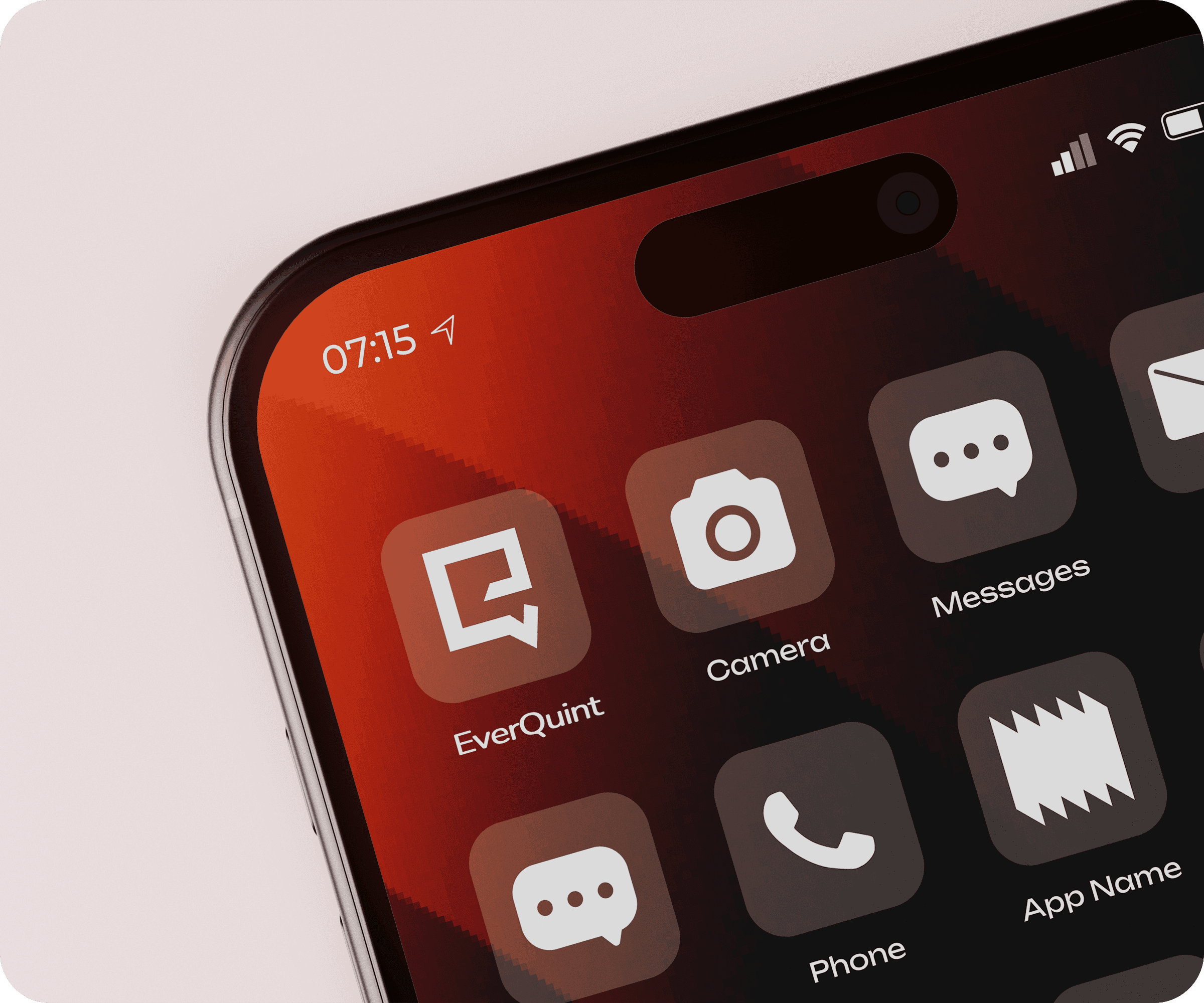
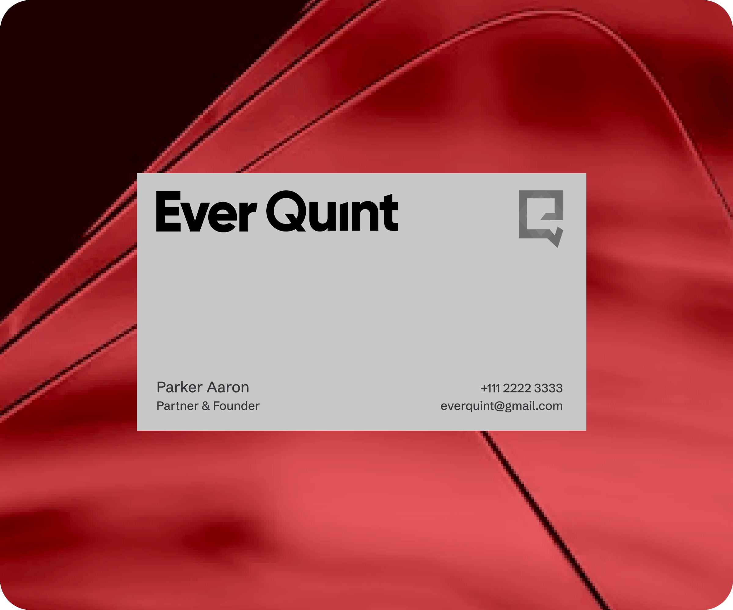
Everquint is a partner agency that approached Pepperistic to define a clear and minimal brand presence. The requirement was straightforward but precise: a simple logo mark, a clean text-based logo, and an overall visual direction that felt professional, modern, and versatile.
The challenge was restraint. The identity needed to be distinctive without being decorative, flexible enough to work across platforms, and clear enough to represent the agency without unnecessary complexity.


DESIGN APPROACH
The focus was on simplicity, balance, and longevity.
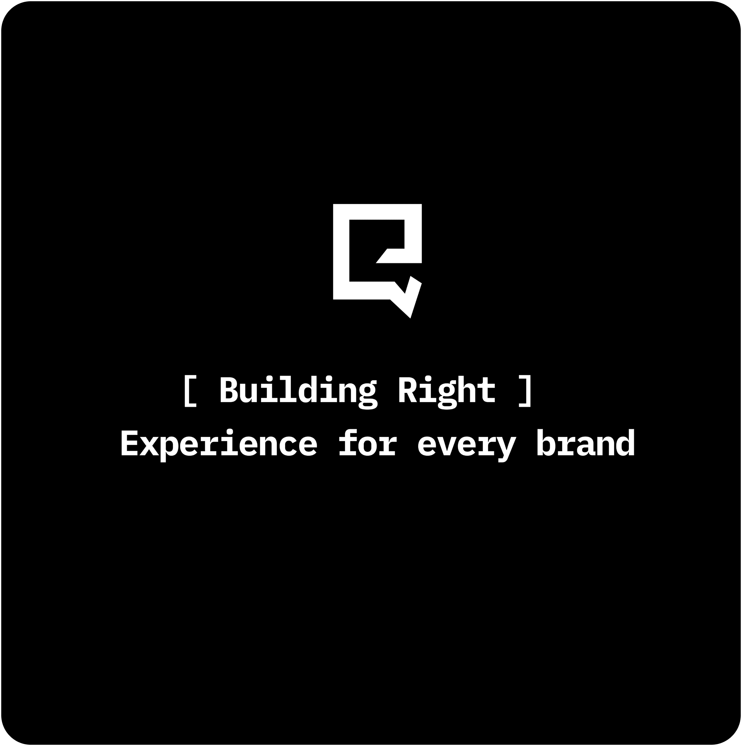
Designed a minimal logo mark paired with a clean wordmark
Established a clear visual direction to guide future brand applications
Prioritised readability, scalability, and consistency across use cases
Every design decision was made to ensure the brand feels confident, adaptable, and easy to apply.


THE IMPACT
The final identity gave Everquint a clear and professional visual foundation. The logo system and brand direction aligned seamlessly with the agency’s positioning, offering a timeless and flexible identity that can scale with future growth.


MORE WORKS